
Comparing Film Scanners: Frontier vs. Noritsu
In my own journey to understand how to best portray the colors of our styling surfaces, I dove into a deeper understanding of film and the different scanner options available at my film lab, Photovision. If you only have a couple minutes to read and look at the images, the take-away is that the best way to really understand the scanner differences is to do your own testing because the scanner is just one element of a larger system that is part science and part art form. Other elements include your meter's precision, your metering approach, your camera, your lab preferences and reference images, the scanner operator, and the film stock. So looking at my scanner comparisons and others on the internet will only give you a partial understanding of the differences. So my goal in this article is to (1) give you clarity in the fundamental scanner differences, (2) give you a better understanding of the film system as a whole, and (3) explain why it's important to do your own testing and how exactly to approach that.
As we dig into the details, it may be helpful to know that I, the owner & creative director here at Locust Collection, have also been a wedding photographer for the last 10 years - shooting primarily on film for the last 7. This experience is what inspired me to create our portable styling surface and also gave me an advantage in growing the business as I have taken many of the product images myself on film. All that being said, after talking at length with Stephen at Photovision, my faithful lab for all 7 years of my film journey, I was humbled by how much detailed film knowledge I still had/have to learn. It excites me to share what we discussed, and I hope even the seasoned film photographers will pick up something they didn't yet know that can improve their scans and ultimately their business.
So let's look at the first major difference in scanners alone (remember scanners are just one element of a larger film system). All comparison images in this post are straight scans (with the exception of cropping & straighten) and show Frontier scans on the left and Noritsu scans on the right. They were all taken indoors with Portra 800 and plenty of natural light on a Contax 645. I meter with the bulb out facing where my camera will be.

Highlights & Shadows
Right away you can see the first fundamental difference in scanners: The highlights & shadows in the Frontier scanner are clipped while the image scanned on the Noritsu has a higher dynamic range (meaning a better ability to include detail in highlights & shadows). In this example, look at the highlight detail in the white flowers and the shadow detail in the ribbon - Noritsu shows detail in those highs and lows while Frontier does not. Instead the Frontier image comes out with more contrast, a brighter look, and some might consider the colors more idealistic. Neither is "better" - it comes down to your preference.
Greens
The above comparison also exemplifies another fundamental difference: Noritsu has more yellow in the greens while Frontier's shadows shift to cyan, which creates a bluer green. Again, neither is technically better - this is a result of the factory calibration of the scanners. Note that if you love everything about the Noritsu except the greens, your film lab cannot make the Noritsu greens more blue - that is a simple hue adjustment on your end in Lightroom or Photoshop.

Building on the knowledge that the Frontier causes a cyan shift in the shadows, you can understand that it does this with every color, not just greens. Think about when you photograph a newborn on a white blanket - the shadow side will shift blue if scanned on the Frontier, while the shadow side will stay more neutral if scanned on the Noritsu. Because of this, some may describe the Frontier blacks as more blue.
Or in the example above, you can see the Frontier scan is showing the plates and paper as cooler/bluer while the Noritsu scan is more true to how the plates and paper look in person.
Summary of the Fundamental Differences in Scanners
| Frontier | Noritsu |
| Brighter with more contrast automatically | Control to increase or decrease contrast |
| Idealistic colors | More accurate colors |
| Bluer greens | Yellow greens |
| Shadows shift to cyan | Shadows remain neutral |
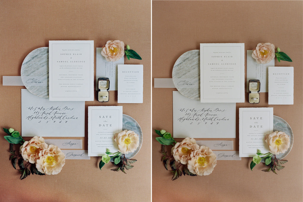
Applying this knowledge to Flatlays

Because the Noritsu has more control to suppress contrast and a higher dynamic range as explained above, Stephen said they do not like scanning flatlays on the Frontier where they tend to be more contrasty & loose detail in the writing. The above example shows how the two peach papers are blown out in the Frontier scan while the color is retained in the Noritsu scan.
In general, flatlays are the most challenging type of image to scan because the scanning operator has no point of reference. When scanning a scenery image that was taken outside, at least the operator knows what color certain trees or a concrete wall should be and therefore can have a base point to work from. So Stephen recommends taking digital copies of your flatlays and editing them for color and brightness so the operator can have something to match.

The Film System as a Whole
Let's look at the film system as a whole with the scanner being one component while other elements include your meter's precision, your metering approach, your camera, your lab preferences and reference images, the scanner operator, and the film stock.
I was surprised to learn that everyone's camera and meter could be off by a stop or two - maybe in different directions! You may already be compensating for these imprecisions without realizing it - maybe rating your film 2 stops over or maybe by metering with your bulb in.
There is also variability in film stocks as you all know. I learned that Portra 400 has a smaller range of exposures that will create an "optimal" result while Fuji 400H and Portra 800 have a wider range. That means you need to be more precise with Portra 400 and maybe you should actually be rating at box speed. And perhaps the reason you (and I) liked Fuji 400H was because you can just rate it 2 stops overexposed to account for the imprecisions in your camera or meter (again unknowingly) and everything turned out fine. Each film stock has its own response curve to light which is quite interesting, and I plan to dive into this math in a future post for those interested.
All of these factors together create a kind of synergy, all while you are capturing emotion - creating art.

Next Steps
I encourage you to test the scanners and other elements of your film system yourself. Most importantly, you will become the best artist you can be when you stay true to yourself and your unique aesthetic much more than trying to emulate someone else's choices for scanner, film stock, etc. But also on a fundamental level, you may get a better understanding of where your film system's imprecisions lie and how to best optimize your system to achieve the results you want.
To test thoroughly, choose scenarios where you often photograph - a person inside, a person outside - on a cloudy day, on a sunny day, flatlays, etc. Then choose film stocks you want to test like Portra 400 and Portra 800. Set your camera on a tripod and start four stops underexposed and take a picture. Repeat taking exposures as you slow your shutter speed a stop until you are 6 stops overexposed. This is called an exposure ramp. Do this for each film stock and location, and then get the film scanned on both scanners. If you want to better understand pushing and pulling film or the effects of exposing for highlights vs shadows, test these things as well. When reviewing the results, determine which settings & scanner is creating the look that you want and it may be different for each scenario. Maybe you like the Frontier for photographing people outside but the Noritsu for flatlays inside. Set up a call with your lab to help analyze and thoroughly understand the results. Your lab will be happy to dig into your test together as a productive use of time.
Thank you again to Photovision for spending so much time explaining the scanner and film details to me. And to Amy at Plume Events for all florals & styling for the comparison images.


